
Role: UX Designer
Access Direct
Expanding Market Reach Through a Scalable, User-Centric IA
Overview
Trading Website Redesign
The existing trading platform website served multiple user groups- individual traders, introducing brokers (IBs), and companies looking for white-label solutions. However, the information architecture (IA) was fragmented, making it difficult for users to navigate and understand value propositions talking to their specific problem. My goal was to streamline the IA, improve usability, and ensure each audience could quickly find relevant information and relevant action. The result was a more intuitive website where each audience could quickly find what they needed, leading to improved engagement and conversions.
process
Research and Discovery: Following a Lean UX approach
Talking to Users
Before jumping into solutions, I needed to understand how different user groups experienced the site. I conducted interviews with traders, IBs, and potential white-label partners to learn about their goals, frustrations, and what information they needed most upon visiting the site.
Prospective traders primarily cared about easy access to pricing and information about platform features. IBs needed clearer and transparent commission structures. White-label partners were looking for integration details and branding options but often struggled to find them.
Many users also mentioned that the site felt outdated and text-heavy, making it difficult to scan and digest key information efficiently.
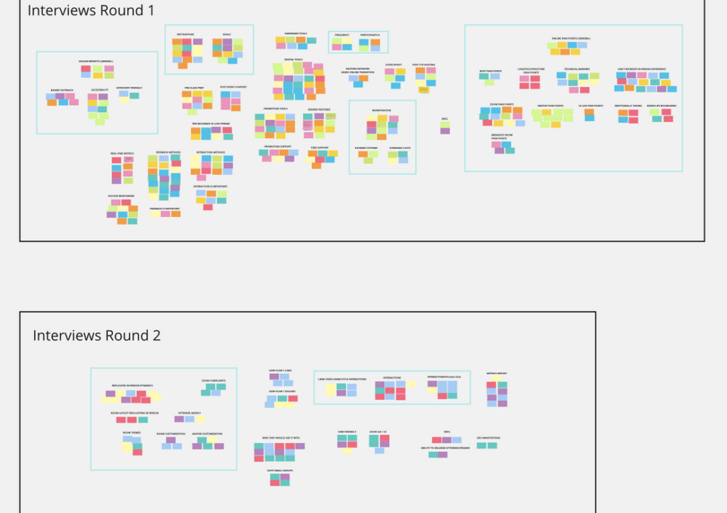
Analyzing User Behavior
Beyond interviews, I turned to Hotjar screen recordings, heatmpas and website analytics to observe actual user behavior. Where were they clicking? Where were they dropping off? The data confirmed what we heard in interviews- users frequently got lost in the navigation, and key pages had high bounce rates.
I mapped out user journeys to visualize how different personas navigated the site. The gaps were clear: entry points weren’t intuitive and the site lacked a clear content hierarchy.
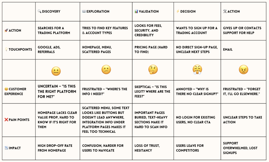
User Journey Trader – Before Redesign
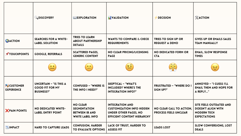
User Journey White-Label – Before Redesign
Assumptions and creating testable hypothesis
Based on our findings, we formed assumptions about why users were struggling and framed them into testable hypotheses:
- If we simplify the IA by reducing the number of top-level categories and clearly segmenting content for traders, IBs, and white-label partners, users will find relevant information faster, leading to fewer drop-offs.
- If we modernize the visual design by improving readability, typography, spacing, and UI components, users will find the platform more credible and easy to use, leading to higher engagement and conversions.
These hypotheses guided our design decisions and helped us measure the impact of changes.
Process
Redesign
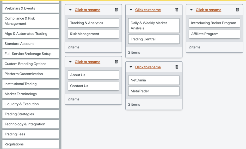
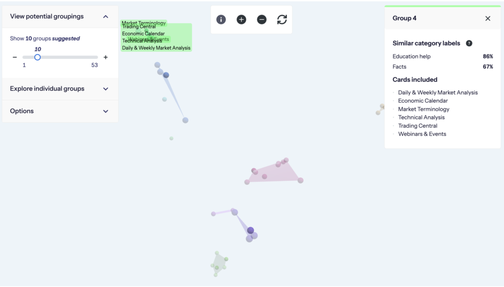
Card Sorting: Restructuring the IA
To better align the navigation with user expectations, I conducted a card sorting session with the different user types. This helped uncover how users naturally grouped content and which categories made the most sense to them.
We found that traders, IBs, and white-label partners needed distinct sections instead of being mixed together. Frequently accessed resources were often buried under less relevant categories, making them harder to find.
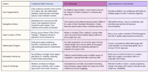
Competitor Analysis: Learning from Best Practices
I analyzed how competitors structured similar offerings. The best platforms had clear user segmentation, fewer menu options, and strong calls to action. Their white-label program pages clearly explained value propositions, something we lacked.
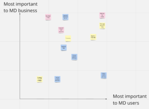
To balance User goals and Business goals we mapped out priorities for the Business and Users on a scale. This helped ensure we were aligning with business and user goals in mind.
Structuring the New Information Architecture
Based on insights from card sorting, competitive analysis and interviews, I restructured the website’s information architecture to better align with user expectations. Before moving on I walked through common user journeys, ensuring the structure aligned with user expectations.
Tree testing, iterate, iterate
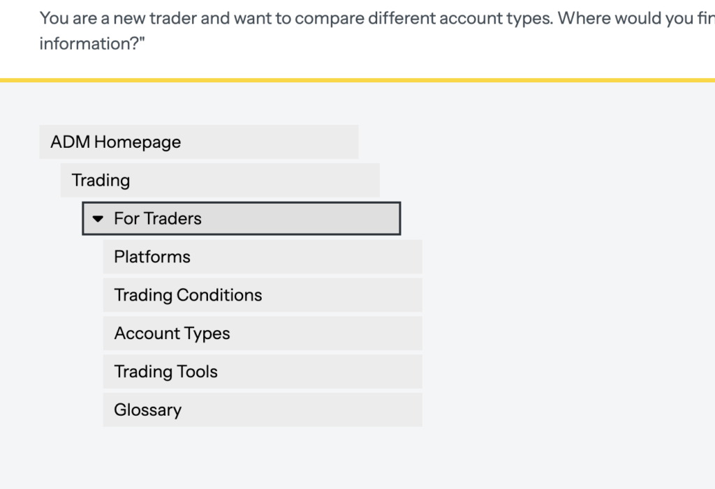
Before implementing changes, we tested our new IA using tree testing. Users were asked to find specific information as well as complete tasks that assessed how they interpreted category labels, navigated to less obvious resources, and located key business goals. By including both straightforward and subtle challenges- such as finding secondary resources that hinted at broader category comprehension- we gained insight into potential problem areas and refined the structure accordingly.
Low-Fidelity Mockups & User Validation
After refining the IA through tree testing, the initial plan was to create low-fidelity wireframes to test the new layout and structure, then refine them into high-fidelity designs for further validation. The goal was to ensure users could easily identify key sections, understand the hierarchy of information, and navigate intuitively. However, as the project progressed, we learned that the timeline had been pushed forward due to the company’s need to secure funding.
With limited resources and a tighter deadline, we had to make a critical decision early on- whether to spend time refining the UI and visual design or focus on improving the information architecture and navigation. Since IA forms the foundation of the site, we prioritised restructuring the content, simplifying navigation, and strengthening calls to action (CTAs) before validating the low-fidelity wireframes. This approach allowed us to create a site that was functional and intuitive, even without extensive high-fidelity iterations. If more time and resources had been available, it would have preferred to develop high-fidelity mockups earlier, validate them through user testing, and run A/B tests on critical CTAs.

Solution
Scalable, User-Centric Navigation
The Information Architecture
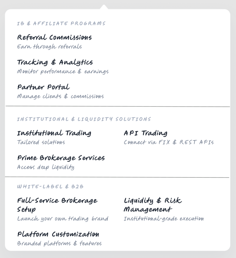
- Clear User Sections – Instead of mixing content, traders, IBs, and white-label partners now had dedicated sections with clear navigation paths.
- Simplified Top-Level Categories – The number of top-level categories was reduced, ensuring a more intuitive experience without unnecessary complexity.
- Prioritizing Key Content & Actions – High-value pages, tools, and resources were placed in prominent positions, with improved CTAs that aligned with user goals such as Log In.
- Improved Content Hierarchy – I refined the hierarchy to ensure essential information was easier to access while de-emphasizing redundant or rarely used content.
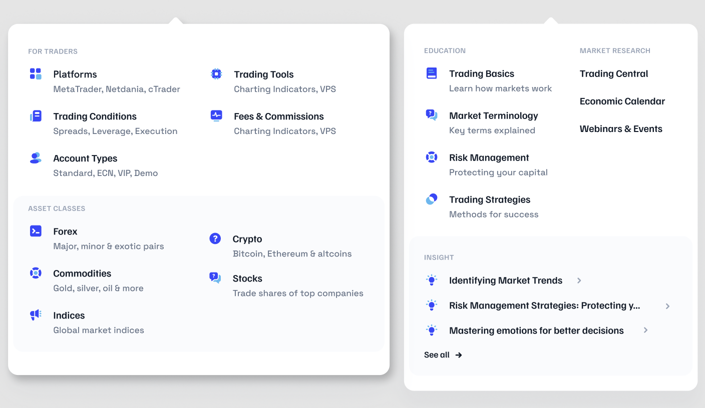
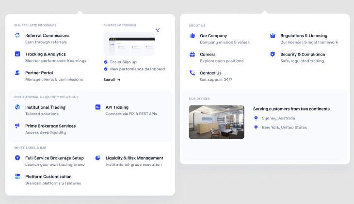
The new menu making it easier for different users to find information relevant to their goals.
The Website Design
- Modernised Look & Feel – Updated the visual design to align with industry standards, making the site feel more professional and trustworthy.
- Stronger CTAs – Designed clearer, more prominent call-to-action buttons to drive conversions and guide users effortlessly.
- Improved Readability – Reduced text-heavy sections, added visual hierarchy, and used whitespace effectively for better scannability.
- Refined Page Layouts – Structured content with intuitive layouts, making it easier for users to find relevant information without feeling overwhelmed.
Outcomes
The redesign had a measurable impact on usability and engagement:
- Users found relevant information faster. Time to complete key tasks was reduced by half, making it significantly easier for traders and partners to find information and take action.
- Users were more engaged and navigating more effectively. Bounce rate decreased by 31%, indicating they were finding what they needed without leaving.
- The site felt clearer and more credible. Potential clients reported that the site answered their questions, and the modernized design made information easier to digest.
- White-Label Partner Signups. While it was too early to measure a change in sign-up rates, both support and sales teams reported fewer inquiries about information already available on the site. Potential clients also shared that the revamped webpage provided clearer navigation and effectively answered their key questions.
Before
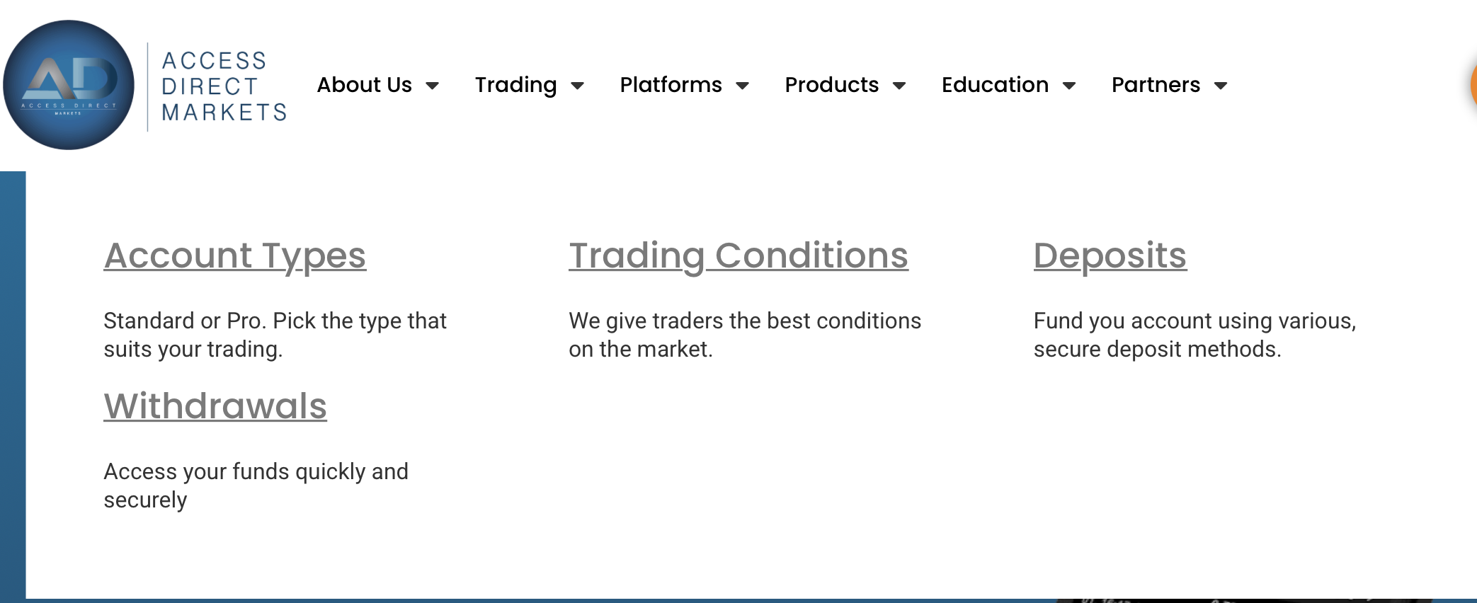
The old menu doesn’t guide the White-label partners where to navigate to become a partner or where they can find specific white label information.

The old menu doesn’t guide the White-label partners where to navigate to become a partner or where they can find specific white label information.
The old Home Page featured sections that looked like buttons. No CTA to “Become a partner” or login for existing users. The site had poor readability and didn’t adhere to usability guidelines.
After
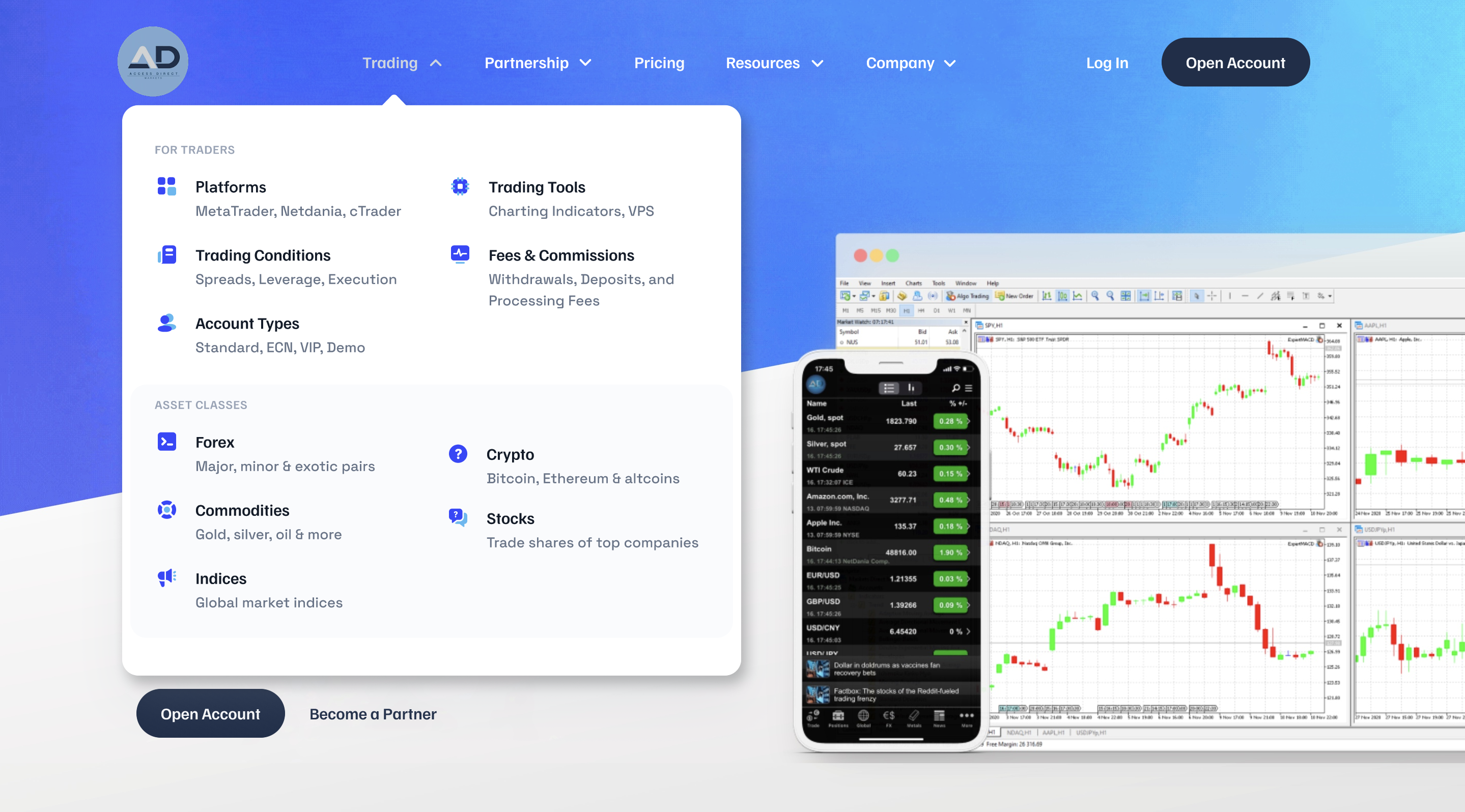
Menu clearly labels what section is “For Traders” ensuring users the info below is relevant to them.
The new Home Page featured fewer menu options. Easier entry-point to logins, easy to scan information with CTAs.
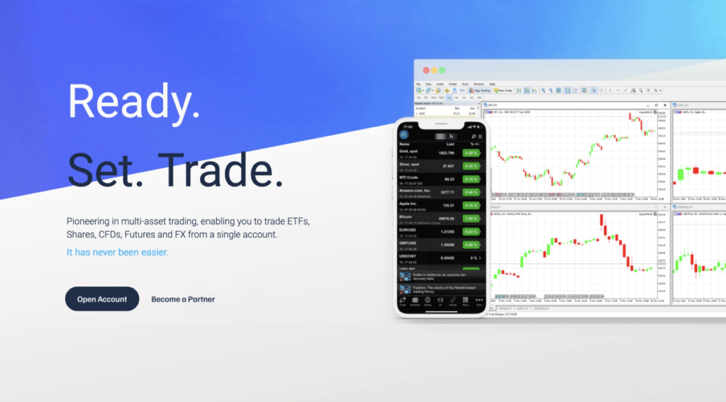
The new Home Page featured a CTA to “Become a partner” to boost partner sign ups, aligning with business and users goals.
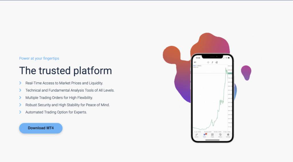
The platform pages had a clear summary of the main features and capabilities of each. Helping users make quick but informed actions without overloading them with too much technical info only relevant to White-Label partners.
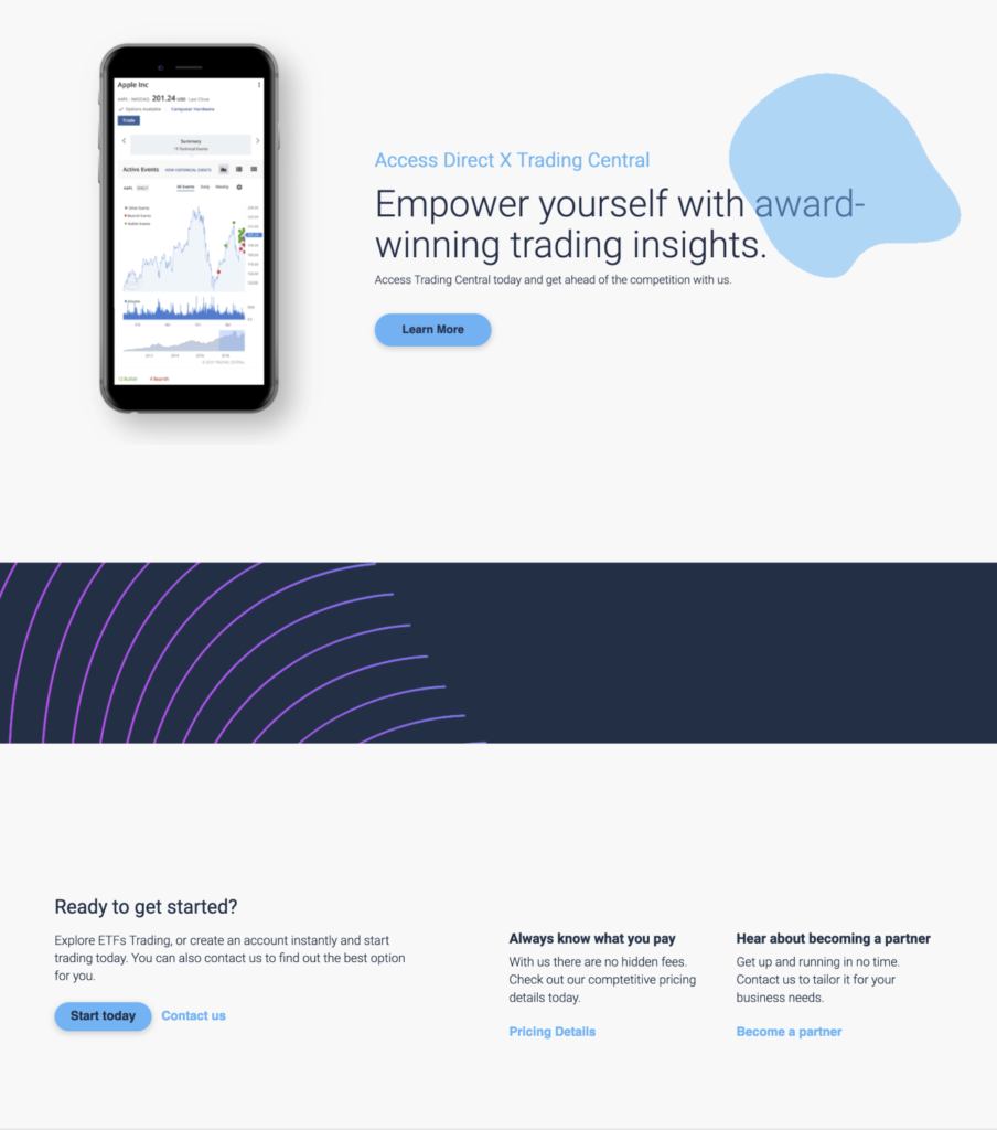
Each page had a footer with relevant CTAs as well as clear ways to navigate to relevant pages. Guiding users to new information to help them take action and make a decision.
Key Takeaways
User-Centered IA Improves Navigation
Clear segmentation of content for traders, IBs, and white-label partners significantly reduced friction, helping users find relevant information faster.
Continuous Testing Enhances Usability
Tree testing and iterative feedback loops ensured the IA and design decisions were validated before launch, reducing post-implementation issues.
Small Changes, Big Impact
Minor UI adjustments, like optimising CTAs and simplifying menus, led to significant improvements in engagement and ease of use.
Scalability Matters – The IA was designed to be flexible and scalable, allowing for future expansions without requiring a complete redesign. As the platform evolves, new products and user types could be integrated without changing the existing experience.