
Role: Product Designer
Smart Page Builder
Ecommerce page lifecycle management in the hands of AI and the user.
Overview
A Shift to Product-Led: Turning Insights into User-Centric Solutions
When I joined Longtail UX, the company was service-led, relying on manual processes to meet client needs. To improve scalability and user experience, we transitioned to a product-led model, focusing on user autonomy and flexibility.
Insights from the UVP project had already highlighted a need for both automation and user control. In this project, we uncovered the exact features users wanted to manage themselves—such as metadata editing, keyword re-categorisation, and result overrides—and the areas where automation could create the most value. This deeper understanding guided feature development, prioritisation, and reinforced our product-led approach.
process
Research and Discovery: Learning from Users
Observations– Learning from Internal Workflows
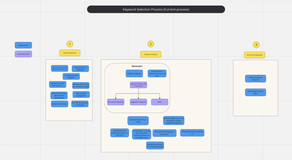
I spent time observing internal workflows by shadowing the customer success team as they worked with the system. Shadowing the team revealed inefficiencies in tasks like metadata adjustments, re-categorising pages, performance analysis, and handling exceptions. Tasks as these were frequent and ideal for automation. These were tasks that required ongoing manual intervention and highlighted a need for automation to streamline these processes.
User Interviews – Understanding Client Needs Directly
I conducted user interviews with a range of clients. These conversations were crucial in uncovering deeper insights into their frustrations and desires. Clients, who had no direct control over page configurations, often relied on intermediaries to make even minor updates. They expressed a need for real-time visibility and control over their pages, particularly for tasks like adding cold content, adjusting meta tags, and overriding algorithm results. These findings clearly indicated a need for more user empowerment.
Identifying Core Problems
Through this research, we distilled some key pain points:
- Users lacked control over page management and relied heavily on our internal teams.
- Users wanted flexibility to edit content and SEO, override automated results, change status of pages and add pages.
- There was a need for automation of backend processes, but with the flexibility to manage exceptions and make adjustments as necessary.
Process
Feature Prioritisation and Lean Development
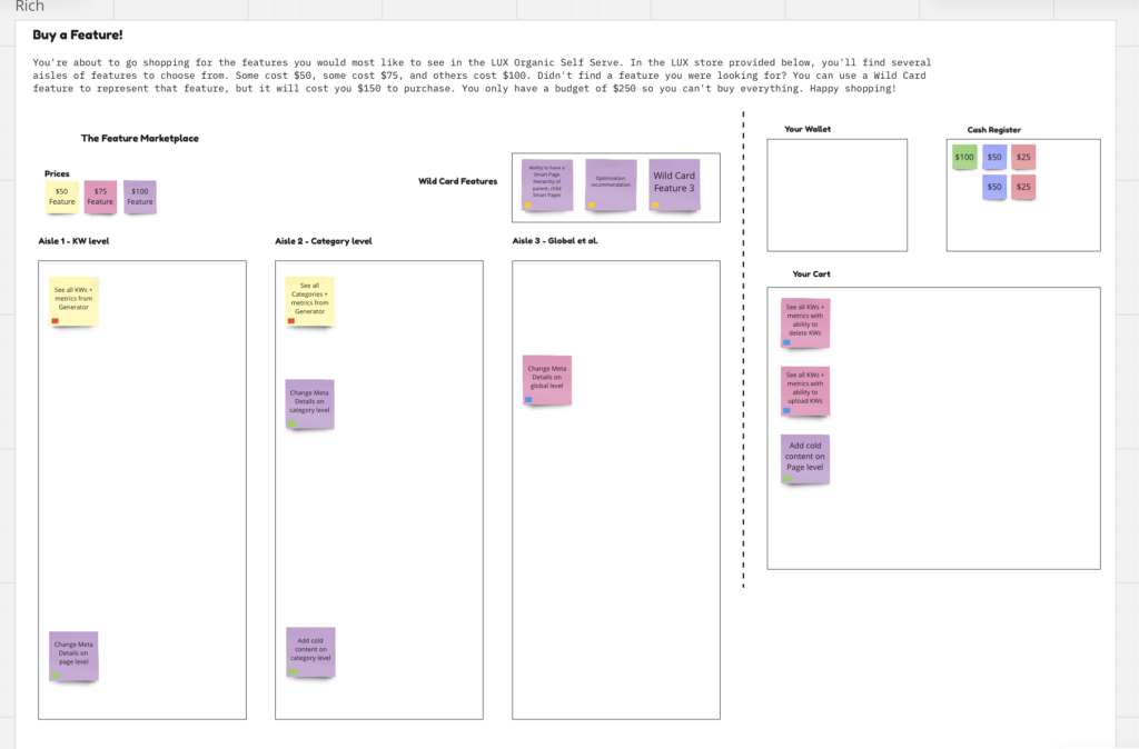
Buy a Feature Workshop
Based on the research, we identified features that would address the user pain points. To prioritise the features, we held a “Buy a Feature” workshop with stakeholders, where we introduced the pain points and needs identified during research.
The engineering team pre-estimated the effort required for each feature, assigning costs based on complexity. Stakeholders were given a limited budget to “buy” the features they thought were most valuable and aligned with the user and business needs.
This exercise allowed us to make informed decisions about which features to prioritise, balancing user needs, business value, and technical feasibility. The outcome helped us align the entire team on what features should be developed first and set the foundation for the next steps.
Feature Development Approach
Before starting the MVP and each subsequent feature, we identified the problem we were aiming to solve and formulated a hypothesis around it. This allowed us to have a clear direction from the start and ensured our iterations were purposeful. By validating these assumptions through rapid testing, we ensured that every new feature would meet user needs and create real value.
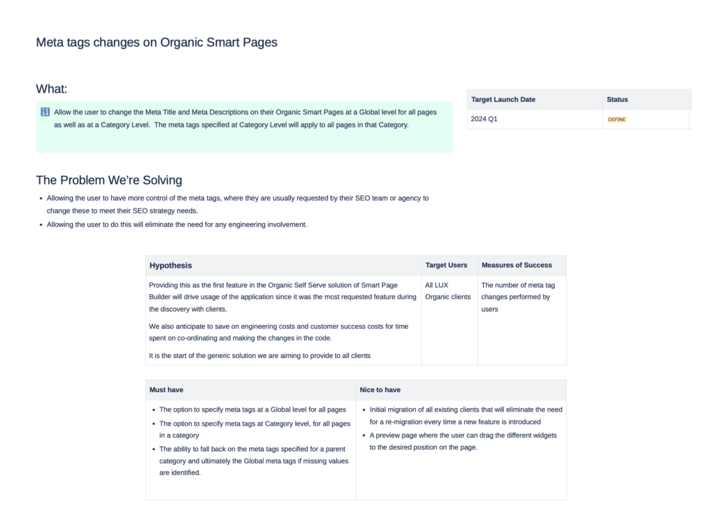
Starting with an MVP
To quickly validate our approach and gain insights into user behaviour, we began with a lightweight MVP focused on solving a critical user need—meta tag editing. We created mockups and gathered feedback through user interactions before moving into development. This iterative process allowed us to fine-tune the experience efficiently, ensuring we built what resonated with users.
Starting with a targeted feature like meta tags helped us confirm the solution’s potential and set the stage for future enhancements. We broke larger features into smaller releases, enabling rapid iteration and continuous user feedback to guide improvements.
Iterative Development with Lighthouse Users for Continuous Feedback
We collaborated closely with five lighthouse users, meeting weekly to gather insights on early mockups and potential features. Their feedback influenced design decisions before development, keeping iterations focused on user needs. After launch, additional feedback from user tests, heat maps, and session recordings further shaped the product. This continuous feedback loop ensured every feature aligned with user workflows and delivered a more intuitive experience.
Solution
Iterate, iterate, iterate
The solution
Key features in the hands of the users included:
- A widget system for customising meta tags, top and bottom content, and banners.
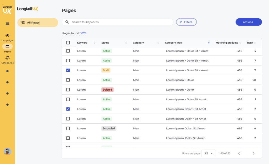
- Category-level settings like redirects, related categories, performance metrics, and bulk page creation and status change.
- Page editing and page-level controls for status changes and algorithm overrides.
The design kept the interface clean and user-friendly, maximising screen space with a left-aligned navigation rail. This combination of automation and user control streamlined workflows while maintaining flexibility for customisation.
A Widget-Based Approach to Customisation
We adopted a widget-based system to ensure scalability and flexibility. Starting with meta tag editing, we created a modular system that could easily expand with additional features like cold content customisation and banners.
Early user feedback, from mockups to post-launch, confirmed that users needed to repurpose widgets across multiple categories to save time. This approach allowed us to quickly deliver core features while leaving room for future improvements based on user input.
Some changes made based on usage data and feedback
From Stepped Flows to Real-Time Control
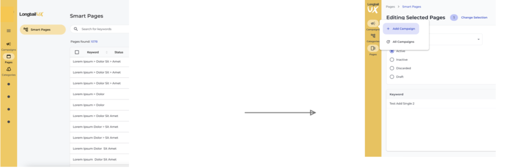
We initially proposed a stepped flow for page creation, but feedback from lighthouse users highlighted inefficiencies and a need for real-time feedback. We switched to inline editing, allowing users to adjust content directly on the page and see immediate results, improving workflow efficiency.
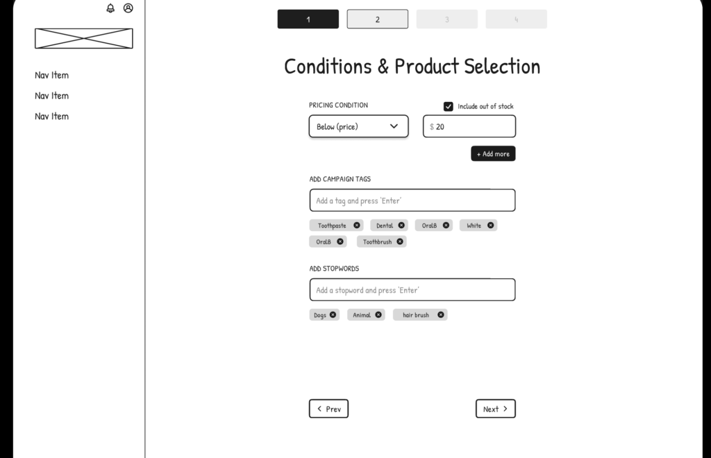
The first low-fi mockup of page editing- a stepped process proved to be inefficient.
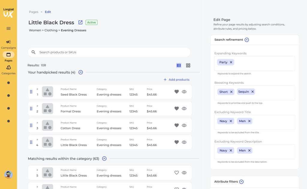
Final iteration – inline editing where users can see what impact their actions have.
Adding pages pop-up
The original plan was to automate categorisation, but due to technical constraints, we had to rely on a manual process within our internal system. To avoid delays, users filled out spreadsheets, referencing another one. This resulted in inaccuracies and low visibility due to poor categorisation. Based on user feedback, we improved the process by guiding users on how to select the correct category, which significantly reduced errors.
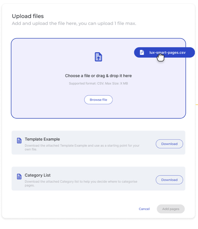
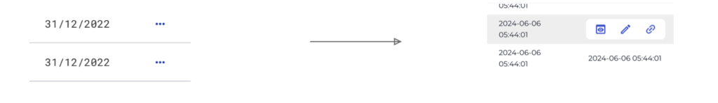
First version of adding pages- a lot of pages with inaccurate results.
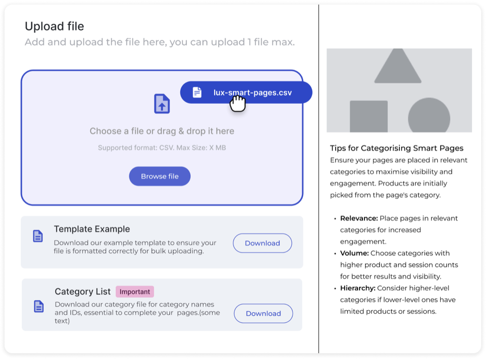
Second version of adding a page- increasing product accuracy on pages.
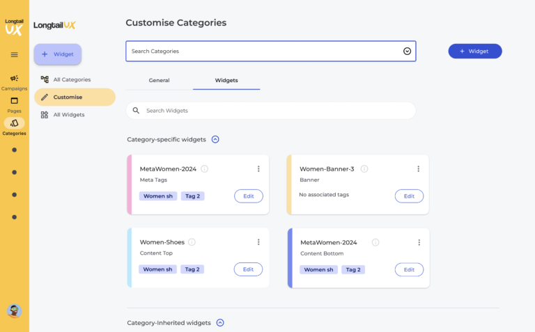
Editing Meta Tags
Users could edit meta tags by adding a widget at the category level, but initial adoption was low due to poor visualisation. To address this, we introduced a preview showing a live example for a random page within the category, improving clarity and usability.

The first iteration of meta tags wo preview – low usage
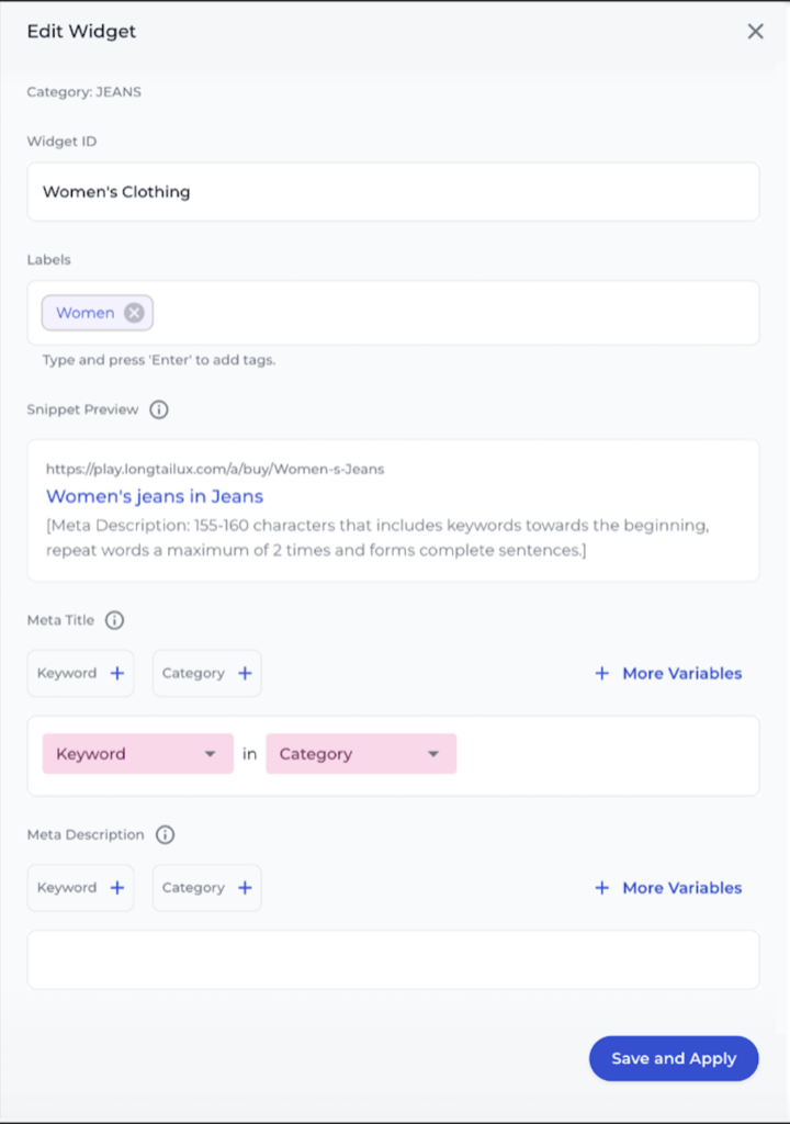
Second iteration of meta tags- usage increased with the preview.
Editing Meta Tags
Screen recordings showed that users were missing the actions button after selecting pages. In the next iteration we introduced a pop up promoting actions.
Users had troubles finding ‘Action’ button.
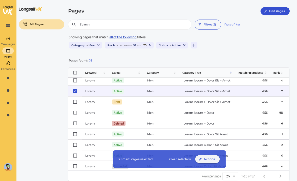
Users got promoted as soon as they started selecting pages.
Small changes that made a big difference.
Adding definitions for statuses, navigation menu changes and action options to show on hover are all examples of small changes made that resulted in big usability wins.
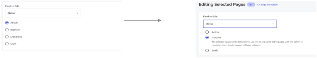
Changes made to status change.
Changes made to navigation to provide more realestate which made inline editing possible as well as providing a better UX for the Pages and Categories tables.
Reducing clicks needed to perform actions, as well as saving realestate on tables.
Key Takeaways
Prioritisation Drives Results:
Success came from prioritising based on user feedback and real needs. For example, while users wanted to add pages, their real concern was managing page status. Understanding why behind requests helped us focus on the most impactful solutions first, driving better outcomes.
Iteration Is Key to Delivering Value:
Rapid iteration with lighthouse users, from MVP to post-launch, allowed continuous improvement. Switching from stepped flows to inline editing, based on real-time feedback, improved efficiency and usability. This experience reinforced how iteration and quick feedback loops create user-centric solutions.
Aligning Product and Technical Constraints
When technical constraints limited automation in the categorisation process, we adapted by guiding users through a manual system. This experience highlighted the importance of balancing ambitious design goals with practical implementation, finding creative solutions to deliver value despite limitations.
Small Changes, Big Impact:
Minor changes, like adding a meta tag preview and streamlining navigation, led to major usability gains. Reducing clicks and enhancing visibility cues improved efficiency and made the product more intuitive, proving that small design tweaks can deliver significant impact.